International Atherosclerosis Society

The International Atherosclerosis Society (IAS) is a global network of cardiovascular experts, established in 1979, who encourage scientific study of atherosclerosis and develop resources for clinicians who provide treatment.

•Overview
IAS worked with Taproot on a full redesign of their website, athero.org.
The IAS team found that the existing site didn’t give clear voice to the organization’s purpose, and that its presentation of information and program areas was confusing to uninitiated visitors.
The new site would also need to emphasize the global scope of their work, because IAS represents more than 60 independent medical societies, or constituent members, and is expanding with outreach to Asia, the Middle East and North Africa.


Challenges
Difficulties with the user experience | An obscured sense of purpose
•Challenges

Difficulties with the user experience
In the years since it launched, the existing site had become difficult to navigate as ever more content had been added to the site without full consideration for the user experience. The navigation menu used lengthy drop-down lists, some with ten or more options, and many pages were blocked by a confusingly unexpected and unnecessary login screen. Puzzling page names and duplicate content made it challenging for visitors to find critical information. For example, the site’s worldwide events calendar was split into several redundant feeds and pages.
An obscured sense of purpose
The old IAS website failed to offer a clear sense of who IAS is or how they serve clinicians. Without an unmistakable message and a cohesive visual identity, the site presented itself as a collection of separate elements that didn’t coalesce in a meaningful way. On the homepage, for example, a group of training modules with unique cover slide images consumed the majority of the space above the fold, adding a whirl of varying colors and fonts that distracted from salient information. Red, a recognizable symbol of heart health, was overused to the point of steering visitor attention away from relevant content and diminishing the effectiveness of the user experience..


Solutions
Giving visitors a reason to explore | A new direction
•Solutions

Giving visitors a reason to explore
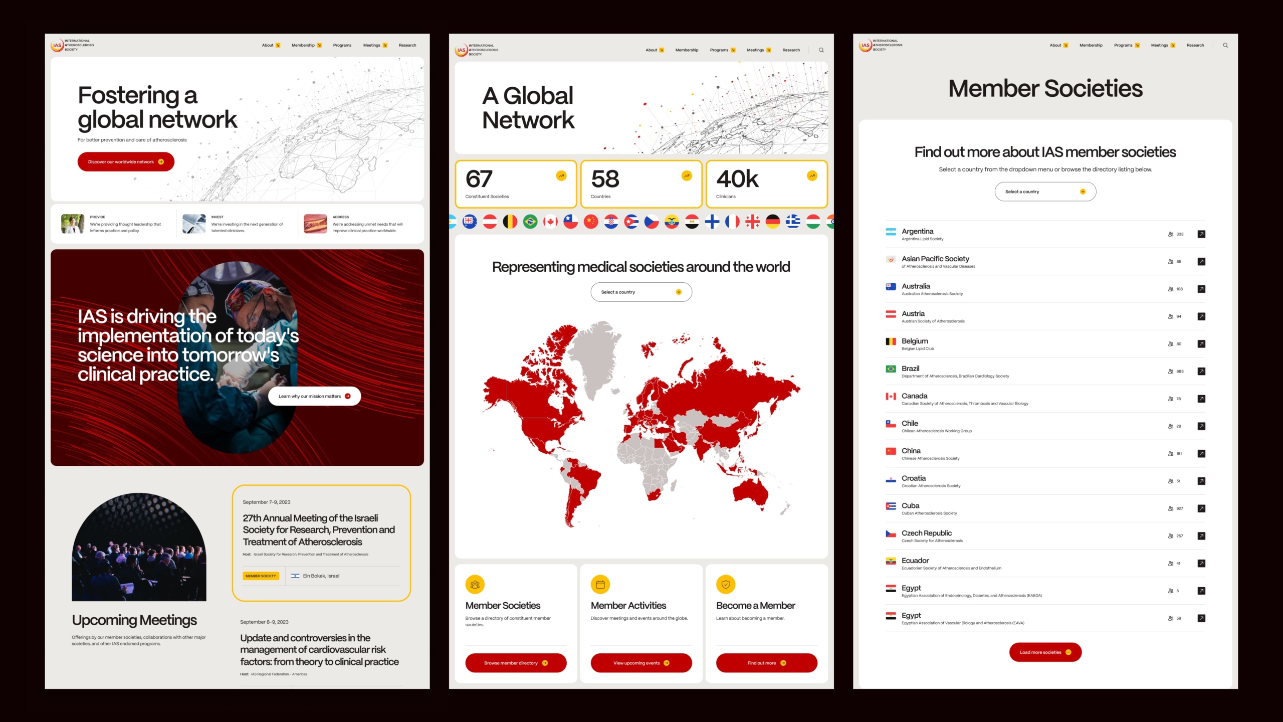
Taproot developed a new sitemap that structures the website around important content and program areas. We also refined the main navigation to give visitors an improved mental map of the information on the site and where to find it. In a series of wireframes and interactive prototypes, we reworked the homepage to make it an effective marquee and a helpful starting point for visitors. The new homepage has clearly defined entry points to internal pages, including an events calendar preview that displays colorful flag icons alongside event locations.
A new direction
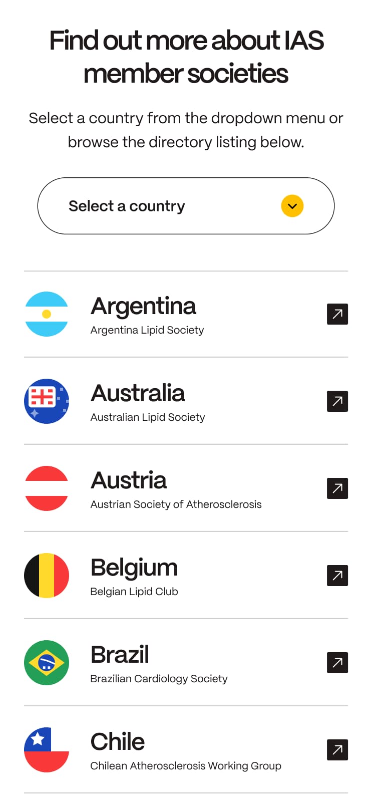
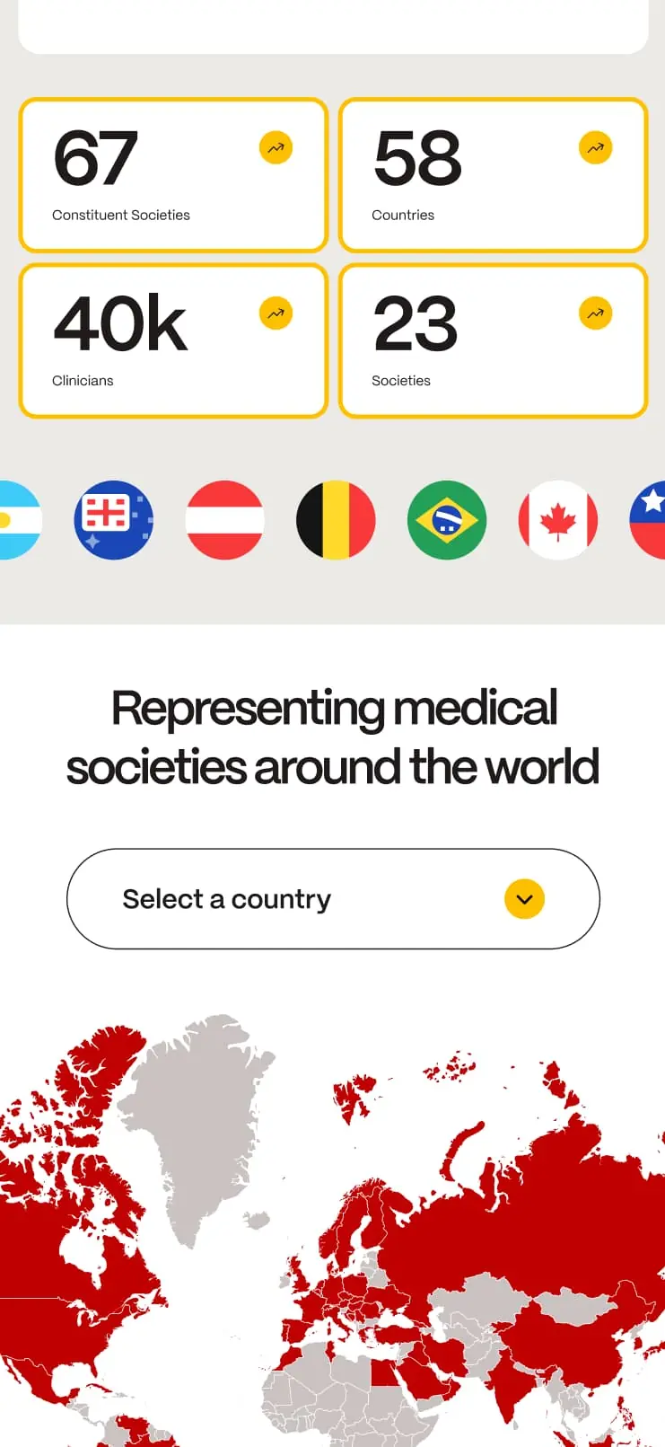
Taproot created a way for IAS to visualize its network of member societies. For the site’s new membership landing page, we built an interactive map that shows the locations of members around the world. Users are able to select a country to get details about active societies and IAS is no longer required to manually edit associated graphics. The website has been built to automatically update itself based on the member roster. We also developed additional custom functionality, including a neatly organized directory of member societies that visitors can search or browse, and a decorative, animated banner that highlights the national flag of every member.

Results
Compelling | Distinctive | Engaging
•Results
Moreover, the design of the new website engages the viewer in ways that the old site could not.
To make the site a compelling flagship for IAS, Taproot designed an all-new look and feel while also developing custom functionality that freed IAS staff members from the regular upkeep that was required of them on the old website.
Moreover, the design of the new website engages the viewer in ways that the old site could not. When a visitor lands on the new home page, the distinctive masthead and smartly organized structure of the design draws the reader in, prompting them to work their way inward to gather more information about their area of interest. The hero design, which features a swirling, abstract background and was inspired by the biology of a human circulatory system, leads the way, followed by a visually engaging map that communicates the full global reach of IAS.
IAS announced the new site’s launch to over 40,000 clinicians and healthcare professionals, and since launch, they’ve recruited new members in Peru, Colombia, Lithuania, Slovenia, Nigeria, Bahrain, Lebanon, Cameroon and Afghanistan, with more likely to follow.