DONA International
After successfully laboring through challenging financial times, DONA International emerged ready to embark on a new beginning – a vital journey to revive the hearts of its members and reclaim its reputation as the most respected doula association in the world.
We executed a multi-faceted discovery initiative that included a membership survey and materials analysis, among other primary and secondary research methods.
The data we collected revealed significant opportunities to enhance the value of membership, improve communication across all mediums, and help members better connect with association leaders and each other.

How we delivered
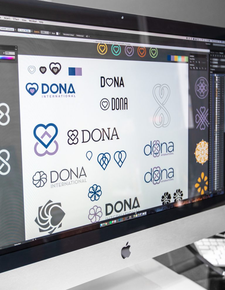
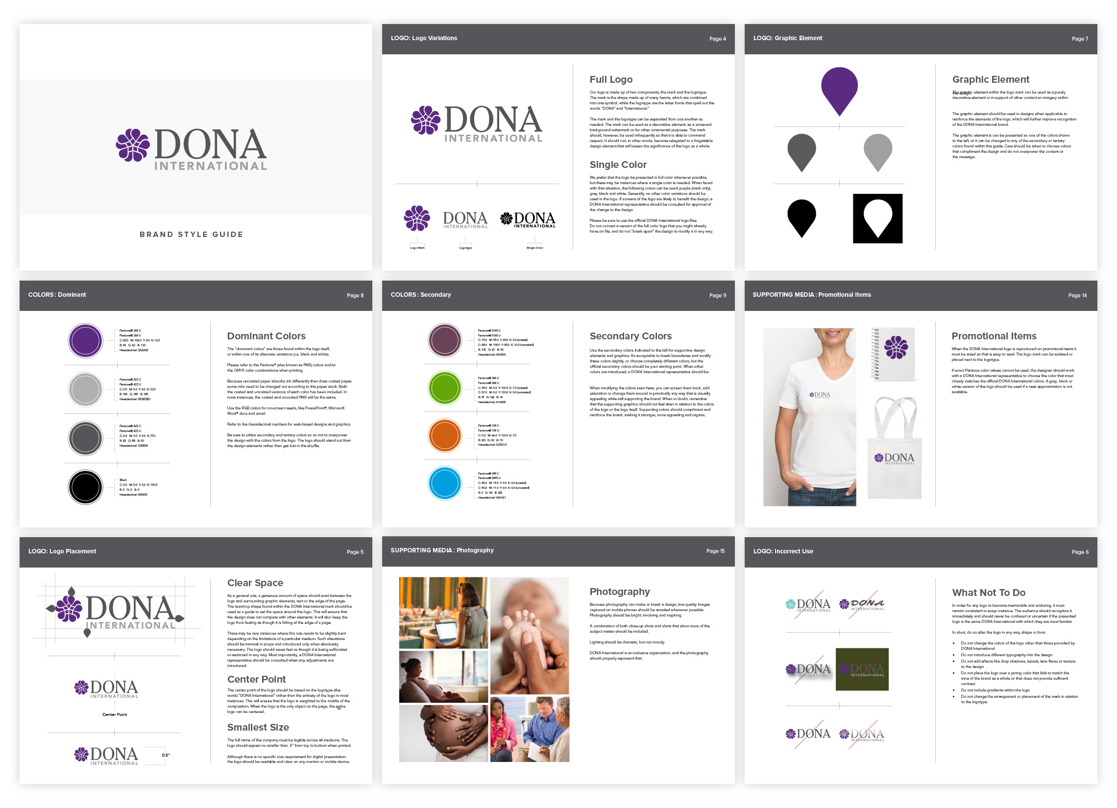
We used the data gathered from our research to inform the development of a comprehensive brand strategy. This included the design of a new logo to better align with the organization’s focus on professional development, evidence-based training, and global advocacy for the benefits of doula care.
The new logo lends added credibility to the association and the doula profession while paying homage to DONA International’s rich history. The symbol reflects a modern-day evolution of the interlocking hearts that have defined the organization since its inception in 1992. The five hearts represent DONA’s five founders, while the mark as a whole features a mosaic symbolic of the association’s diverse membership, all bound together as one in DONA International.
We also devised a brand rollout plan to release the updated look to the broader membership, which served as a roadmap for the reveal and outlined key messages and cost-effective strategies and tactics for announcing not only the change in brand identity, but also the additional changes the organization had in store for members in response to their survey feedback.

Taproot developed a detailed member relations plan intended to support the longterm health and sustainability of the association by strengthening member engagement and increasing member retention. The plan identifies specific recommendations for adjusting membership structure, improving the new member onboarding process and strengthening member communication.
The results
DONA International’s new brand identity received overwhelmingly positive feedback from members – an incredible feat considering studies showing logo redesigns are rarely well-received, especially by those who identify the strongest with the brand.
Studies also show that negative reactions to logo redesigns can be curbed when organizations properly manage customer expectations by handling the project with transparency, and when they carefully articulate the reasons for the change. This is exactly the way we encouraged DONA International to approach their momentous transition, and it paid off in droves.
The association is now well-poised to implement their member relations plan and has already begun to see a positive shift in membership culture with the #DONAProud movement.